

The problem
Where it started.
The old site scored F, 36 out of 100. It was a fixed 960 pixel column, so a phone showed a shrunken desktop page with the phone number off screen. It took 11.4 seconds to show its main image and carried about 75 words on the homepage.
One of the three veterinarians was missing from the staff list, there were no service pages, and the only way to act was to call during office hours.
Why this approach
The decision behind the work.
A patch would have touched every line of all four files and left a 2016 layout underneath, so a rebuild cost nearly the same and fixed the structure.
Ads were left out on purpose: the problem was a failing page, and paid traffic would only have landed on it. A CRM was left out too, because the practice already had one for scheduling.
The solution
What was built.
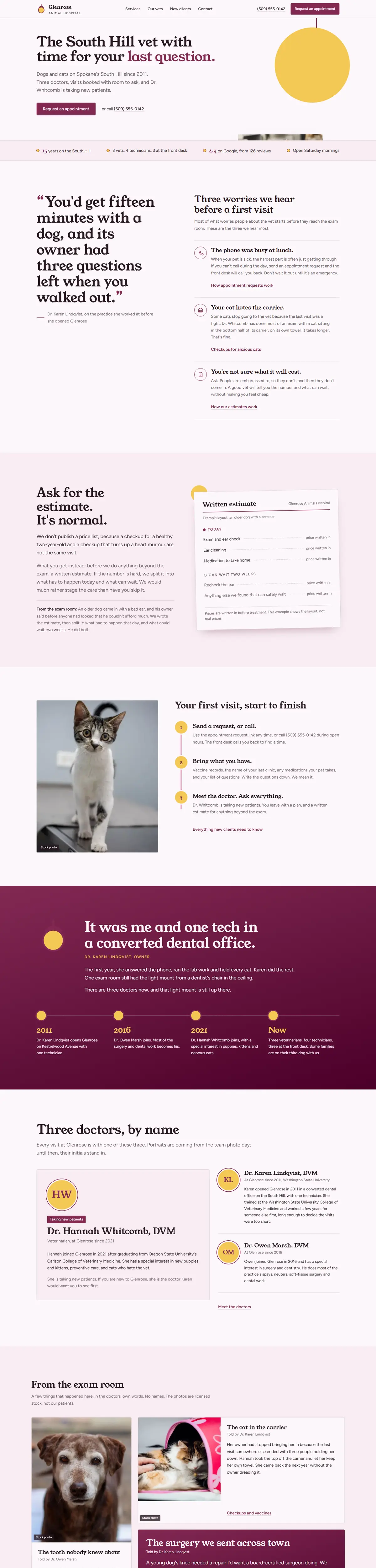
A 13-page site written around something true about the practice: the owner opened it because visits at her last job were too short to answer an owner's last question. That became the headline, and a converted dental office with an exam light in the ceiling became the visual motif.
Six service pages, all three doctors by name, a new-client page, tap to call on every page and an appointment request path, with accessible, fast, search-ready pages throughout.
Design and psychology
Why it looks the way it does
Colour
Not clinical blue and white. Mulberry feels warm and caring and sets the practice apart from chain clinics. The yellow nods to the exam lamp in the original dental office.
Type
A friendly serif for headings and an open sans for body, in a tone of unhurried and honest. Corners are only slightly rounded, so it looks capable, not toy-like.
Faces
No stock photos of strangers in scrubs, because they could be mistaken for the three named doctors, which the site must never imply.
Stack of delivery
What it was built and measured with.
What changed
The numbers that moved.
Homepage performance score on mobile
Time to show the main image
Homepage SEO score
Page weight in KiB
In their words
“Our old site was costing us new clients. The new one explains what we do and families book online.”
Practice manager, Glenrose
Next project
Meridian Ledger Co

Ready to break ground?
Start with the free audit, or book a 30-minute call. Either way you leave with something useful.