
Vshopper
An online store rebuilt for search and quotes: from almost no enquiries to 4 to 5 quote requests a week, with no ad spend.
The problem
Where it started.
The online setup was patchy. Accounts sat under the previous agency's login, tools overlapped, tracking was incomplete and SEO was close to non-existent.
The first audit scored the site 65 out of 100. Structured data was broken on most product pages, 189 URLs returned a 404, meta descriptions were blank on key collections and several collection pages had no main heading.
There was a deeper problem. Most contracts here close in store after a customer clicks Add to Quote. A standard checkout metric would have told anyone the site was not working.
Why this approach
The decision behind the work.
We rebuilt rather than patched, because fixing a broken build takes longer than starting clean and the fixes would have sat on the same weak structure.
The quote request, not the checkout, became the number everything was measured against. Every decision was judged by whether it helped someone ask for a quote.
The solution
What was built.
A full technical SEO audit, then the foundation: control of Google, Meta and TikTok accounts taken back from the previous agency, four overlapping SEO apps reduced to one, and broken structured data traced to the exact character where it failed.
121 redirects built for 189 dead URLs, plus a redirect watcher that now catches renamed or removed products automatically. Twelve blog articles on two new blogs, 36 banner and hero image slots refreshed with 94 images, a quote-first button rule, and a paid media plan ready to run.
Social content built up alongside, and ongoing hosting, SEO upkeep and fixes after launch.
Design and psychology
Why it looks the way it does
Colour
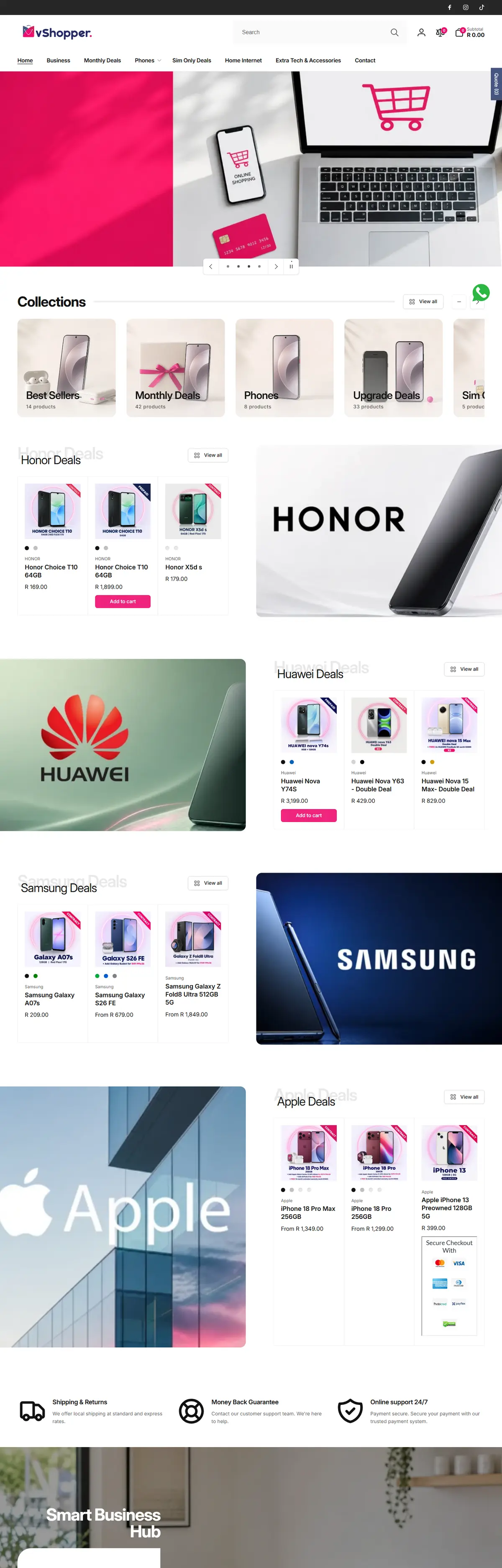
The brand's own palette is navy, crimson, hot pink and lavender. Navy carries trust on a page that asks for money, and crimson is reserved for the action, so the eye finds Add to Quote first.
Banners
Collection banners are a fixed, very wide crop that cuts most images. Each one now uses a blurred, colour-matched backdrop with the sharp product inset, so nothing is cropped away and nothing looks stretched.
Legibility
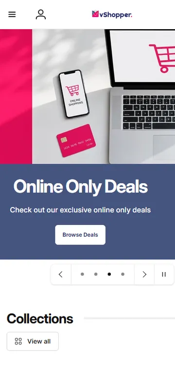
On the homepage slideshow, white text sat on busy photos. A 40 percent dark overlay fixed it without hiding the photo.
Stack of delivery
What it was built and measured with.
What changed
The numbers that moved.
Quote requests a week, all organic, no ad spend
Dead URLs found and repaired
Redirects built, then kept clean automatically
Audit score at the start, out of 100
In their words
“We do not know exactly what you did, but it is working. Keep doing it. The enquiries are coming in and the whole site finally feels organised.”
The Vshopper team
Next project
BIS

Ready to break ground?
Start with the free audit, or book a 30-minute call. Either way you leave with something useful.